





Case Study: Enhancing User Experience on Rockstar’s Website
After a brief look through the Rockstar Games website while making my application for a QA position, I noticed two potential alterations that could improve user experience. The first was a styling issue, whilst the second was a design choice. I have presented these two alterations in this case study.
UI/UX Issue 1: Language Selector Text Overflow
Description:
The language selector in the footer of the primary Rockstar Games website (rockstargames.com) is not correctly formatted. This causes overflowing text to be cut off on the longer language options. This is not the case on the Rockstar Store (store.rockstargames.com).
Debugging Proccess:
1. Check the extent of the bug. The bug is present on both mobile and desktop. It is also present on Chrome, Firefox and Internet Explorer, so the issue is not browser or device specific.
2. Open the page in Chrome DevTools and locate the langauge selector element.
PROBLEM: The page element we are interested in is only available on hover, and triggers a page refresh on click. Therefore we set a timeout in the console: setTimeout(() => { debugger }, 3000) and access the elements while timeout is active.
3. Locate the appropriate CSS styling options for this element. As the issue is associated to overflow and the foundry font is being used, this is the section we are looking for.
Solution:
There is no CSS white-space property. Adding the following property resolves our issue: white-space: normal;
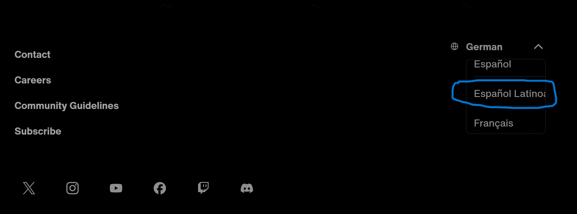
Image 1: Text clipping in language selector of Rockstar website.

Image 2: Text already wraps correctly on the Rockstar Store.
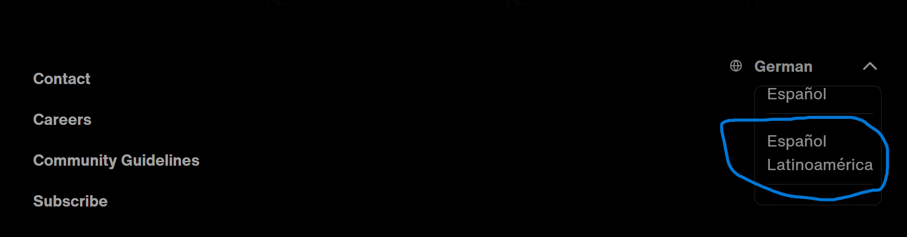
Image 3: Text wraps onto the next line after adding white-space property.
UI/UX Issue 2: Unfriendly Blog Navigation Experience
Description:
The Rockstar Newswire blog posts have navigational breadcrumbs. When clicking a breadcrumb link, users are taken to the relevant post collection page. If the page a user clicks into is still part of a breadcrumb chain, the user will expect to find breadcrumb navigation on that page too.
Howver, when we click onto any of the breadcrumbs in the Newswire blog, we only recieve a list of blog posts in the category. We lack any navigational or filtering ability, which creates an inconvenient and abrupt user experience.
Solution:
The addition of a navigational breadcrumb chain to blog collection pages like the one already present on the blog posts themselves will improve user experience, and have the additional benefit of being more SEO friendly too.
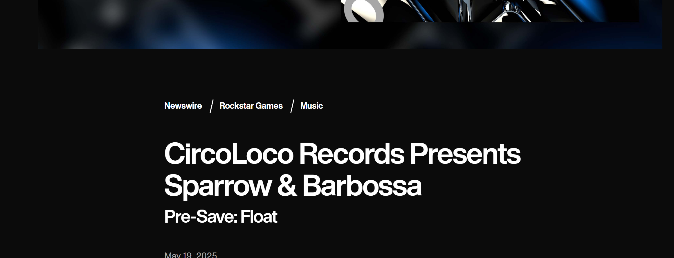
Image 1: Multi-level breadcrumb navigation is present on blog posts.
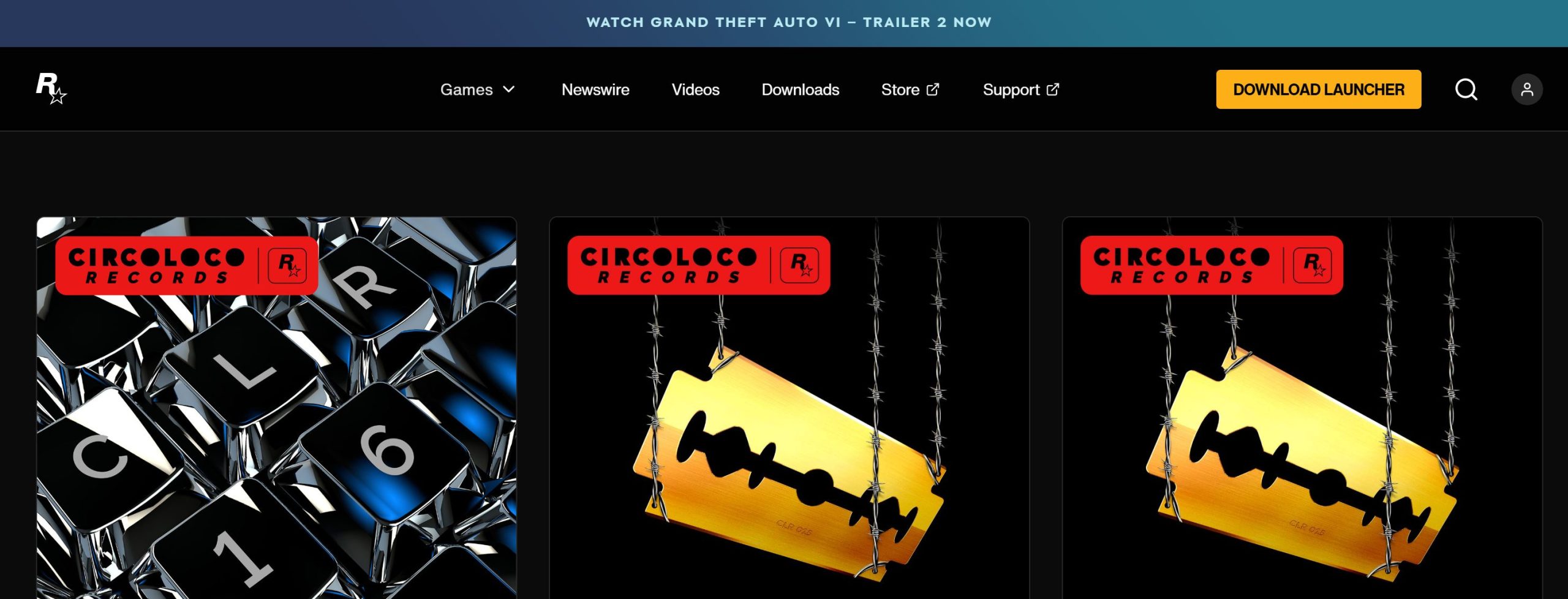
Image 2: Breadcrumb navigation is not present on the blog collection pages.